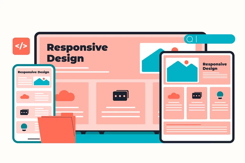
To attract and retain visitors, your website must be responsive. Many sites make common design mistakes that hurt traffic and conversions. A mobile-first approach isn’t enough, responsive design is constantly evolving, so avoiding common errors is essential for success. Developers must avoid these 9 common mistakes we cover in our blog. Let’s start!
Why Mobile Responsiveness is Crucial
Before delving into the 9 critical mistakes to avoid, know the importance of M-responsiveness:
- Improved User Experience: A mobile-responsive website ensures a consistent and user-friendly experience across devices, reducing frustration and increasing engagement.
- Better SEO: Search engines like Google Place importance on mobile-friendly sites in their rankings.
- Increased Conversion Rates: As per studies M-responsive websites have higher conversion rates compared to non-responsive ones, as users are more likely to complete desired actions on a well-designed mobile site.
- Competitive Advantage: No doubt about this, it has become a necessity and having an M-responsive site is an added advantage.
9 Mistakes in MRWD
1. Desktop-First Approach > Mobile-First Design
One of the most common mistakes in mobile responsive web design is adopting a desktop-first approach. This traditional method involves designing for desktop computers first and then adapting the website for smaller screens. However, this approach can lead to compromises and suboptimal experiences on mobile devices.
Instead, it’s recommended to embrace a mobile-first design philosophy. Designing and developing your site with mobile devices as the primary focus, ensuring that the core functionalities and content are optimized for smaller screens from the outset. By prioritizing mobile, you create a solid foundation that can then be scaled up and enhanced for larger screens.
2. Button Size and Readability Issues
Tiny buttons and illegible text are common pitfalls in mobile responsive web design. On smaller screens, elements that may appear adequately sized on a desktop can become challenging to interact with or read on mobile devices.
To avoid this mistake, ensure that all interactive elements, such as buttons, links, and form fields, are large enough for comfortable tapping with fingers. Additionally, improve readability by using fitting font sizes, line heights, and contrast ratios that make text easily legible on mobile screens.
3. Too Many Images
While visuals are essential for engaging users and enhancing the overall website experience, an excessive number of large, high-resolution images can greatly impact load times, mainly on mobile devices with limited bandwidth or slower internet connections.
To mitigate this issue, optimize your images by compressing them without sacrificing quality, and consider implementing responsive image techniques, such as serving different image sizes based on the device’s screen resolution.
4. Failing to Prioritize Speed
In the mobile world, speed is paramount. Slow load times and typical sluggish performance can lead to frustration, abandonment, and ultimately, lost opportunities.
To prioritize speed, focus on optimizing your website’s code, minimizing HTTP requests, leveraging browser caching, and implementing techniques like code minification and compression. Additionally, consider implementing performance optimization strategies such as server-side rendering, progressive web apps (PWAs), or accelerated mobile pages (AMPs) to get lightning-fast experiences.
5. Neglecting Cross-Browser Compatibility
With the vast array of mobile devices and browsers available, ensuring cross-browser compatibility is crucial for delivering a consistent experience to all users. Neglecting this aspect can lead to layout issues, broken functionality, or even complete inaccessibility on certain devices or browsers.
To avoid this mistake, thoroughly test your website on various mobile browsers and devices during the development process. Utilize browser compatibility testing tools and emulators to identify and address any potential issues. Additionally, adhering to web standards and best practices can help ensure your website functions consistently across different browsers and platforms.
6. Not Using a Clear Copy
On smaller screens, concise and clear copy becomes even more important. Lengthy paragraphs or complex language can overwhelm mobile users, leading to confusion and disengagement.
To create a mobile-friendly content experience, prioritize clear and concise messaging. Break down information into easily digestible chunks, use simple language, and leverage formatting techniques like headings, lists, and bullet points to improve scannability. Additionally, consider implementing content prioritization strategies, ensuring that the most important information is prominently displayed on mobile screens.
7. Inadequate Font Sizes and Spacing
Proper font sizing and spacing are crucial for ensuring readability and accessibility on mobile devices. Tiny fonts or cramped text can strain users’ eyes, leading to frustration and potentially causing them to abandon your website altogether.
To avoid this mistake, use larger font sizes that are easily readable on small screens, and ensure adequate line heights and spacing between elements. Additionally, consider implementing responsive typography techniques that automatically adjust font sizes and spacing.
8. Not Testing on Real Devices
While emulators and browser developer tools are valuable resources for mobile responsive web design, they cannot fully replicate the experience of using a real device. Factors such as mobile touch interactions, device performance, and network conditions can vary significantly between actual devices and simulated environments.
To ensure your website performs flawlessly on mobile devices, it’s essential to conduct thorough testing on a range of real devices, including various screen sizes, operating systems, and hardware configurations. This hands-on testing approach will help you identify and address any issues specific to certain devices or scenarios.
9. Overcomplicating the Layout
While creative and visually appealing layouts can be enticing, it’s essential to have a balance between the so-called aesthetics and functionality, especially on mobile devices. Overly complex or cluttered layouts can lead to confusion, and frustration, and potentially hamper the user’s ability to navigate and interact with your website effectively.
To avoid this mistake, prioritize simplicity and clarity in your mobile responsive web design. Opt for clean, minimalistic layouts that emphasize the most important elements and prioritize intuitive navigation. Avoid unnecessary clutter, and consider implementing techniques like progressive disclosure or collapsible menus to present information in an organized and user-friendly manner.
In conclusion, by avoiding the above critical mistakes, you can create a mobile-responsive site that looks amazing and also provides an exceptional UX.


